A new life for Gaya Design, the redesign part 2
Since my blog is based around web development and I don’t want to be behind on things I decided it has time to kick new life into my blog. I needed a new format which would allow short posts and have a blog that loads fast.
I needed a redo of the website. From the ground up.

A while ago I started to regret the fact that there are so little posts on Gaya Design lately and realised I never got / made the time to create content for this blog. It takes a lot of time researching new stuff and getting to know cool new findings around web development.
As some of you might have already heard, I switched jobs and so far it has been awesome. Working here makes me realise just more and more how important it is to inspire myself to get to know new stuff about web development. You can get stuck in a pace at your job where you just do the same trick over and over again. It’s time to step out of that comfort zone.
Gaya Design has been a great escape from that before, and will be again, but I needed a different approach since I also learned a thing or two the last couple of years as a web developer. I will get back on the subject of getting stuck in your comfort zone in a later post.
Time for something fresh.
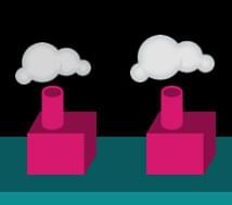 The signature chimneys of the old design
The previous design was made in a time when I wanted to show off what I could accomplish with CSS styling a few funky ideas. I really went all the way with cool gadgets and images not thinking about the main point of the website, which was the content. I am not a designer as profession, but I like to do it as a hobby, and that’s what the website portrayed.
I got a lot of great feedback at the time and make some changes along the way. Implemented some easter eggs (Konami code anyone?), included some third party api streams and fixed some styling along the way.
Since I’ve been working in this business I came across various trends and saw what worked and what did not. I summed up the good and the bad trends before creating my new website and came with a list of requirements:
- No clutter.
- Focus on the article, the rest is not so important.
- Has to be very clean and subtle.
- Needs good to read typography.
- Must be responsive and adjust to screen sizes.
- Retina optimized.
- Need to be aligned to perfection.
- Oh, and a new logo / style.
Where to start a redesign?
It was clear that I had to really take the time and dive into what makes a website work and what makes it clean and good to read. Just a while before starting on my redesign I got sucked into responsive webdesign (way too late!), but it immediately made it clear that I have been doing stuff the wrong way all along.
 The one thing I learned was that composing to a vertical rhythm was one of the best things I could be doing to get a readable blog.
It became clear to me that it makes developing a responsive layout a lot easier. So I set a baseline grid on my new Photoshop document and started drawing some ideas for how the content would come to look like.
When I was done with typography and layout of posts I had to think of a theme for the blog. Since I’ve been into geometric patterns for a while I thought it would look great in a clean design. I started testing out some cool patterns I came across and my logo on accident when I was drawing patterns to test out. I quickly made a vectorized version to test it out in various sizes and positions. I love how simple and beautiful geometric shapes can be and choose to go with this style.
Switching to “design in browser”.
While Photoshop and any similar tool are great for drawing websites and making static content it also leaves a lot to the imagination when you consider it has to become a website some day. Photoshop doesn’t know what an element is in your web browser, it doesn’t know it can scale, it doesn’t know about paddings and margins and surely doesn’t know anything about viewports.
These tools are basically not made to do this, it has been used for this purpose though, thus creating layouts that work really great with the content used for the design, but get crappy 8 out of 10 times once the real content starts to fill the website. Best case scenario designs are easily made and look awesome, but sometimes the real functionality of a web browser is forgotten and contents end up being different in different settings.
If you keep these problems in mind while designing in Photoshop it’s fine, but you really have to find a way to illustrate how the design should react to the browser. I got to a point that made it kind of useless to align my designed content to the baseline over and over again when I changed an element or if I wanted to shift some content in-between elements. Why not design in a tool which knows all about the behaviour of browsers, the browser itself?
The perfect design companion.
Think about it. The browser knows about line-heights, stacking of elements, border, paddings and margins. The browser knows it’s limits and has the behaviour you are designing for.
I got to writing some simple HTML and started to structure my document one section at the time, making a flat and blank canvas for me to paint the ideas I made in Photoshop in the browser.

The layout and styling all happened through the mobile first principle, first making everything work in the smallest version (which is everything smaller than 420px in this case) and then scale it up one step at the time. For viewport sizes I picked an iPhone in portrait mode, one in landscape, an iPad in portrait and iPad in landscape. I set the start and endpoints around those widths, and maybe they’re not perfect, but I thought those were great points to scale the layout to another version.
I styled the elements one by one and ended up with a design that was already defined in my Sass files compiled to CSS. So that was covered. No double work here.
Javascript goods.
The new installation had to be smaller and better. I choose to use jQuery because a lot of Wordpress plugins choose to use it too, and why include another library if jQuery will be included anyway?
Things I know I would need to do in Javascript:
- Fire events on breakpoints; let’s call this “responsive javascript”.
- A slider that works on touch.
- A syntax highlighter.
- Something to maintain my vertical rhythm.
For the breakpoints callbacks I used jRespond. It allows you to register breakpoints and fire events once you enter or exit the width range. Will handle your Javascript events nicely.

As a slider I picked iosSlider. It works perfectly on all devices and does exactly what I need it to do. If you’re making sliders on your website, give this slider a try. It is one of the best ones out there and really worth the money.
The syntax highlighter I found was Prism. It’s really lightweight and was a nice way of styling. I also found a nice Monokai colourscheme to go with it.
For the vertical rhythm I needed something that fixed the breaking of vertical rhythm and but the elements that had the wrong height back in position. For this I wrote my own solution, which I am going to share with you very soon.
Redoing my Wordpress installation, from the ground up.
Because I made my old theme / website when I wasn’t as familiar with web development and Wordpress development as I am now I wanted to start over. I mean, start from the beginning with a totally new install.
I had some plugins running on my old install that I could easily do myself with some hooks and filters, but there are a few ones that I used in the new installation.
Yoast’s SEO plugin, Gravity Forms for my forms, WP Types for my custom posttypes and fields.
The future
I hope to have given you a closer look at how I solved the problems that go with creating a new blog. I also hope this new theme and total redo will breathe new life into my blogging and makes me write a lot more articles to share with you.
Let me know what you think about this layout and how I solved things.